The best classic typeface of 2024: Control.
Nov 12, 2024
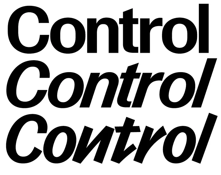
Control was designed by Christian Schwartz and Miguel Reyes, using the sans serif lettering examples in Walter Käch’s 1949 lettering manual Schriften Lettering Écriture as a basis. Schwartz has taken the idea of the lettering manual literally: Control has axes for weight, contrast, and apertures, and users are meant to find the right combination of these for any application. There is no “correct” version—the typeface is meant to be fine-tuned for each situation. The Cursive is loosely inspired by Van Dijk, drawn by Jan van Dijk for Letraset in 1982. The family first appeared in Interview, and the super-tight TNT versions were inspired by the magazine’s archive. Interview’s unique blend of high fashion and downtown trash culture served as the catalyst for the Cursive, which leavens the serious modernism of the upright with strip-mall hair-salon vibes.

